To effectively communicate an idea visually the work needs to be legible. Legibility is mainly affected by several key factors. These include; size, arrangement/alignment, typeface, style/media, colour and context.
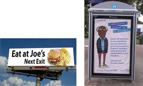
A large motorway billboard with large text. A bus stop advert with more smaller text .
When composing a piece of work it is vital that the end size of the product is taken into account. Say you were creating a large billboard for an advert; you will need to consider the amount and size of the text. It will need to be large enough to be read at a glance and possibly at speed (if the billboard is situated next to a motorway). Yet if you were to create the same work for an advert inside a bus shelter the viewer will have more time to read the details. More text can be used and the size could be smaller.
Be careful about using large bodies of text. Not only can it be discouraging to read the viewer can easily get lost reading it. By grouping the text into paragraphs and limiting the word count to 10-15 per line it becomes more legible.

Decorative typeface. Whilst it can work well when spaced accordingly and as a header, when used for bodies of text it can cause confusion and become illegible.
The style of a piece of work and font used can not only cause confusion if used in the wrong context but also affect the legibility of the work. The sample below would work great for advertising a traditional arts and craft fair, but will be contradictory if used in advertising for a computer fair. Due to the complexity of the font, it is more legible when seen big, so for it to be most legible it would be read easier when used as a title/header.

Yellow and black used effectively as a danger sign.
Colour can also play an important role in the legibility of a piece of work. When dealing with text it is important to understand the idea of recessive and advancing colour combinations. The colour yellow is recessive. When yellow text is placed on a white background it fades and becomes illegible, but when combined with black it stands out. This colour combination is used a lot with important signs that need to be read to avoid danger.
Colour can also make maps easier to read. A black and white detailed map can be confusing and easy to get lost in. With some simple colour coding the map will be easier to read and understand.
The tone of voice used in a piece of work can make it more effective at reaching a target audience and create an effective piece visual communication.

The use of opposing fonts and words.
The strength (or stroke) of text works better if it supports the message it is trying to say. The use of a bold , large font to convey a sensitive word, and vice versa, contradicts the messages intent. The same can be said about the typeface used. A softer, delicate , feminine, italic typeface is more effectively communicative to an audience that follow artistry, whilst a bold, masculine and brash typeface would associate more closely to graphic novel fans.
The context of the work and audience directs the tone of voice used. The use of large graffiti style fonts are used to reach a hip-hop culture, they will not have the same desired effect towards explaining the legislation of leaving land to fallow to farmers.
The colour scheme can also affect the piece of work. Colours have long been associated with emotions and themes. Red is a colour associated with love, passion, bloodlust and fire. It would not communicate the notion of purity and calmness.

A poster promoting the Misfits using ‘Halloween’ colour scheme.
The traditional colour scheme for Halloween is orange, vivid green and black. Combined with scratchy, dripping fonts and disturbing words an effective tone of voice is used to portray Halloween. Whilst anything horrifying is not limited to these colours, you will find that these colours with amplify the message towards a Halloween. If these colours were to be used to support the message of meditation, there will be a feeling of discord and dispute.
All fonts, symbols, colours, images, layouts and overall size of ideas should reflect the research into the target audience and its use. When explored effectively the message will be communicated and understood without confusion.
Links and resources:
Links and resources:


